work / case study - mywave + myia
Case study – MyWave + Myia
Problem statement
How can we help a business get to know its customer to the power of one, in order to give each customer more meaningful and personal outcomes?
The brief
To create a beautiful human centric experience that could give you meaningful outcomes; whether updating your summer wardrobe, planning your next holiday, getting the best deal on your broadband or insuring your car.
An experience based on giving the user control of their information and letting them manage their relationships with the various enterprises and brands. This in turn gives the enterprises/ brands the opportunity to connect with their customers on a more personal level, thus helping them both get their desired outcome.
The audience
As a general benchmark we wanted to appeal to a wide gamut of users as a start, then over time, through research and testing, refine and focus on the appropriate audience depending on the experience and market category.
The full story
01.0
The brand
To create a brand that is user/ human focused, friendly and relatable.
Then extend this to the product and its experiences encompassing many use cases in multiple market categories (UX and UI).
The mark
MyWave (on my wavelength – we as a brand get you). The logo represents the human aspect of the brand, with the character’s hairline representing the ‘wavelength’. The font for the logotype was carefully chosen to support and compliment the icon (being organic and fluid). These elements together represent the marrow of the brand as a whole.
For a more in depth look at the brand and the mark please refer to the brand book.
01.1
Brand collateral
Letterhead, business cards, internal doc templates, investor presentations, all sales & advertising material and company website.

02.0
The product
To create a common experience endorsing the brand that would encompass a variety of use cases covering various market categories ranging from retail, travel, energy, banking, real estate, agri transport to health & well-being and more.
The experience
To extend the brand and design a common UX across various market categories and different use cases - without a specific market category or use case it was quite a challenging exercise to define a ‘line of best fit’ experience that would (with tweaks) be malleable enough to work across many different use cases and markets, be it retail, finance, health, insurance, utilities etc.
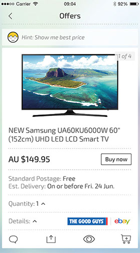
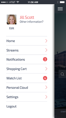
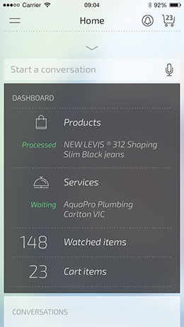
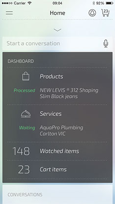
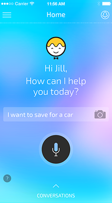
After spending an extensive period in discovery, it was evident that no matter what the market or the use case, if the backbone was one based around being transactional, it would be possible to shape a UX that sat comfortably in most spaces. The overall experience needed common structural pieces; a space where a user could define their intent (I want a new TV, I want to lose weight, etc...), a space in which to share and exchange information, a watch list, a shopping cart & checkout, a dashboard, notifications and a user profile space (where all the user’s information would be stored). These pieces would then be turned off and on to support the different use cases.
The experience had to ensure the user could easily navigate from one piece to another and back without losing their way. The solution was to create a hierarchy through layers; the user would be able to move seamlessly through the layers (up and down, left and right) and always find their way back.

03.0
The process
To determine and design the overall user experience and user interface.
This included: the investigation and discovery phase, white boarding, wire framing, prototyping, designing the UI style and a final Hi-Fi interactive prototype and paper prototypes (mounted on a wall showing the user journey and it’s various permutations), while continuously testing and refining.
a. Investigation and discovery
Time was spent extensively exploring various experiences both in native and web apps as well as desktop, looking at different market categories from retail to health & fitness etc. The findings from these were used to determine a common thread amongst these experiences. Once this was identified, it was used as the basis for moving on to the next stage – white boarding.


Some of the various experiences that were explored
b. White Board & Wireframing
Once satisfied with the findings from the discovery phase, I then moved to fleshing out a meaningful flow - ‘retail’ seemed the most logical experience to use as the foundation/ backbone to start building upon.
03.1
c. The UI
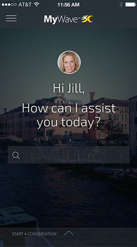
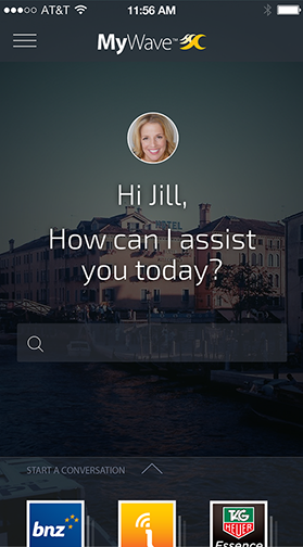
While defining the UX, I simultaneously worked on the UI. The brief was to create a slick, dark and sophisticated UI. After a series of initial designs and user testing we realised that this was not the most suitable approach to take if we were to appeal to a wider audience.
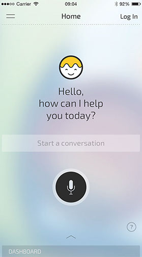
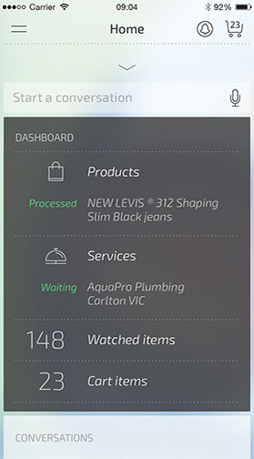
Through the feedback cycle and our findings, a lighter and more friendly organic palette was the final direction taken. Not only did this appeal to a wider audience but it was also easily adaptable to the various experiences and respective brands that would live in the ecosystem. Over time, with the growing design team, the UI was developed and refined even further.

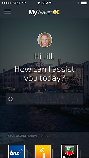

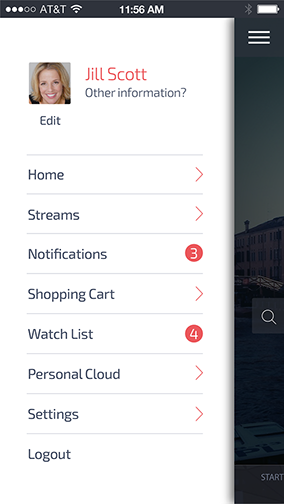


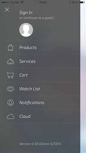
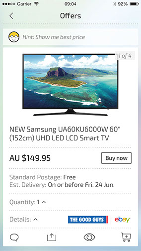
Initial design with dark palette
Light palette
03.2
03.3
Prototyping
Once the UI and the UX was defined, the user journey was mapped out. This was then mounted on the wall for discussion and debate with stakeholders and relevant teams..
An interactive prototype was also built. The purpose of the prototype was not only to test and get feedback but also to reinforce the concept of layers for each of the pillars and how the user would interact and navigate without losing their way – this was critical in driving discussion and in helping get everyone reach a general consensus and common understanding.
UI kit/ mobile, tablet and desktop
The final phase of the UI/ UX process was to build a kit that had all the common building blocks. These pieces were used to build any given experience and ensured that no matter what market category the experience would stay the same.
Using this as a point of reference, the development team built a series of widgets that closely reflected the kit and followed the rules of the UX.
This is just a small portion of the Mobile UI kit.
04.0
The VA
(virtual assistant)
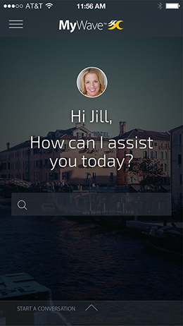
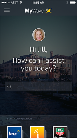
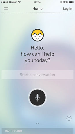
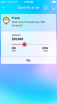
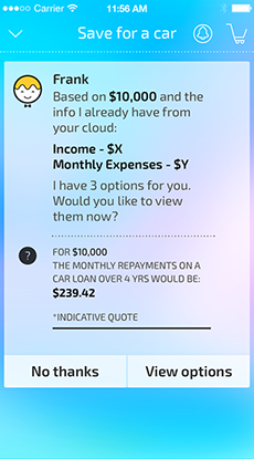
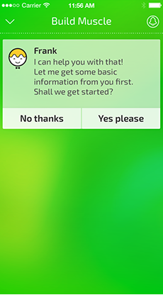
Another key part of the user experience is the personal assistant (the connection between the individual and a brand/ service) – used to facilitate the natural language conversation to help a user get an outcome.
Frank
V1 of the personal assistant was called Frank. He was born as the result of the brand mark. The name was derived from Frankenstein – we were building an experience around many different service and brands encompassing a myriad ways in which a user could get an outcome.
Frank was given a bow-tie to signify a butler – the person always there to help and always in the background, making sure everything is taken care of.


Once the persona was defined it was evident that the tone had to be informal – to make it easier for a user to converse using natural language, both via text and/ or speech.
This also lead to the bow-tie being removed altogether.
Frank to Myia (my - intelligent - assistant)
As the concept of the VA matured and the conversation developed, there came a need to validate the character. This involved a 2 day workshop which looked at creating a male and female persona.
Once created, possible names were explored, tone and language (informal in this case) were defined and a suitable voice was chosen for both male and female roles.
Working collaboratively with our speech and dialogue specialist, suitable talent chosen, time was spent in a studio, recording the various voice prompts that would cover the retail experience (this involved each actor to read a monologue to get them into character and set the tone). These prompts were compiled in a dialogue document. We used this document to define the retail conversation and to also user test the speech component of the experience.
05.0
The sum of all parts...
The sum of each part outlined in the process culminated in defining the final experience. This was then animated, showcasing a typical user journey, the conversation, the interactions and transitions in an end to end experience. It was presented to all stakeholders and was also a point of reference for the front-end team.


06.0


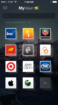
Some of the enterprise customers I've worked with
06.1
At the end of each workshop, all input, thoughts and ideas are collated. These are then used in shaping the various use cases. The use cases are then presented back to the enterprise's customer in the form of an interactive prototype or sometimes as ‘hero moments’ (a snapshot highlighting the key moments in a particular journey) for feedback and testing. Findings from this would in turn form the basis of the various experiences for their respective market categories.
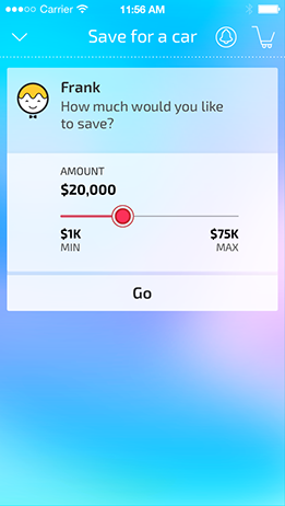
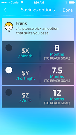
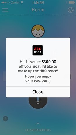
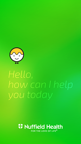
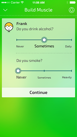
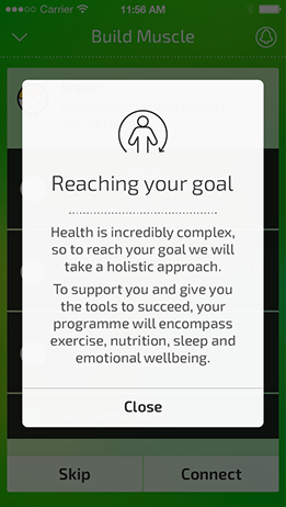
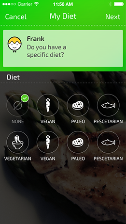
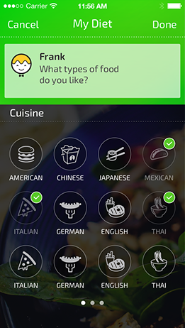
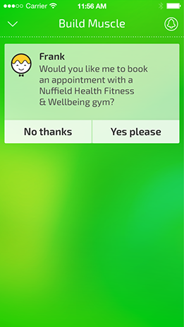
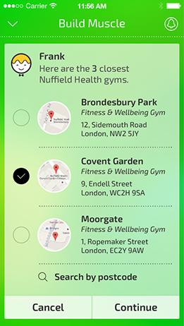
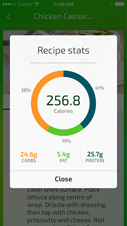
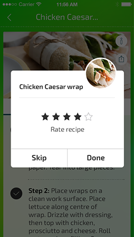
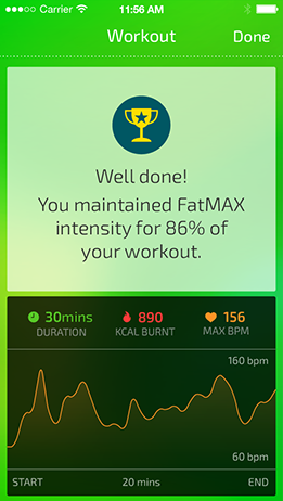
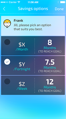
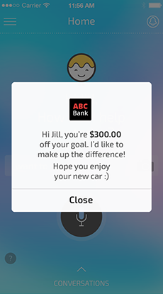
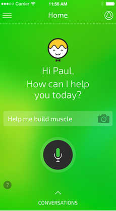
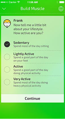
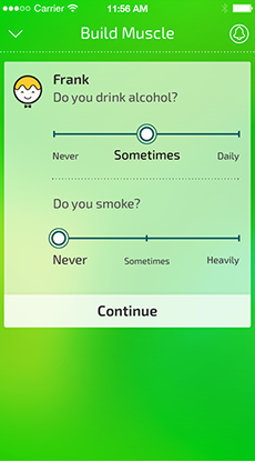
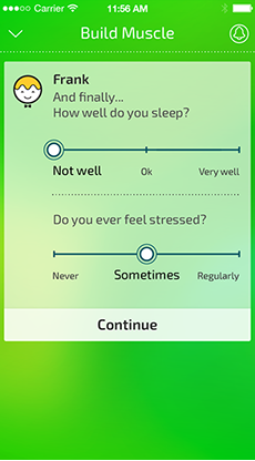
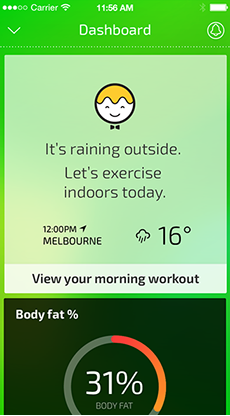
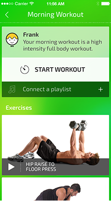
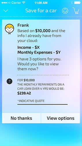
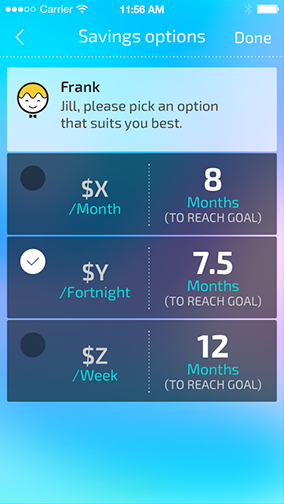
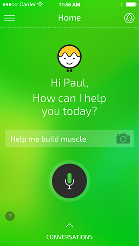
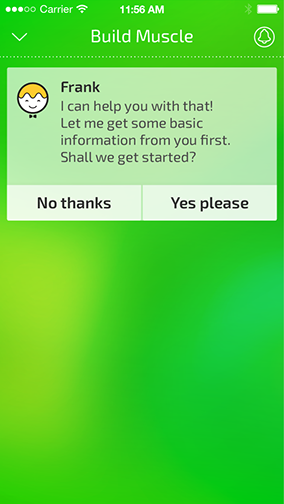
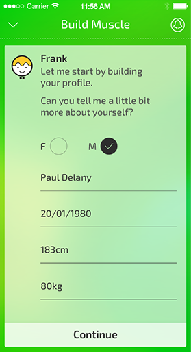
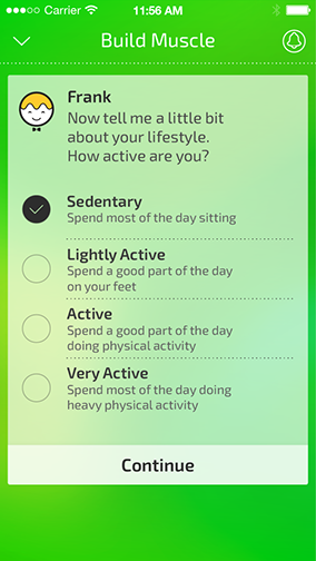
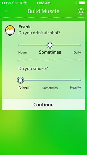
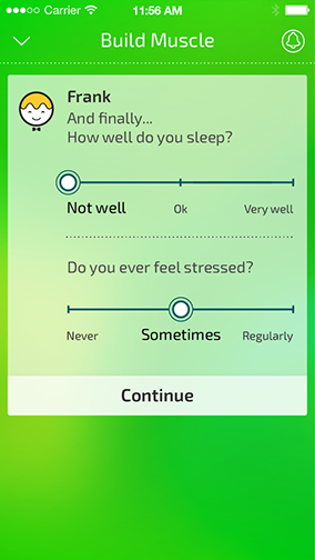
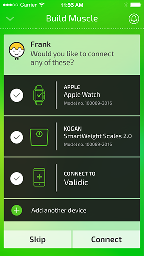
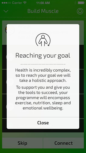
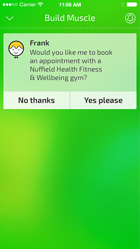
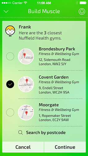
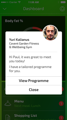
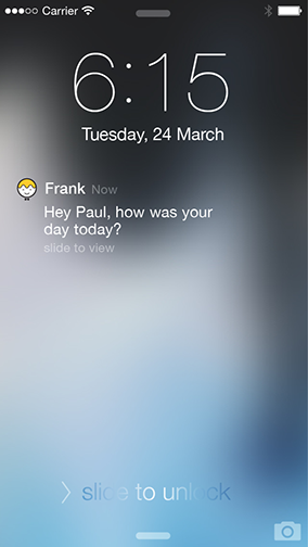
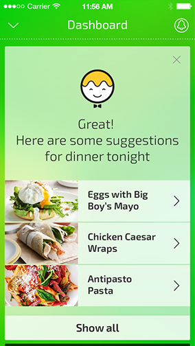
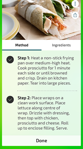
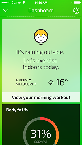
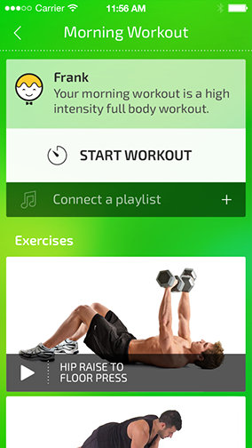
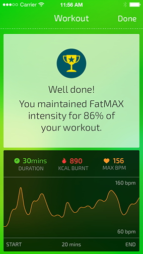
Below are some early examples of how the experience was extended to other market categories.
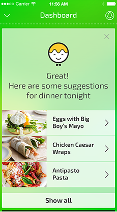
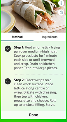
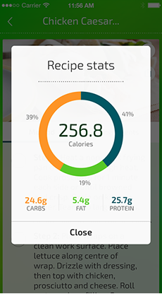
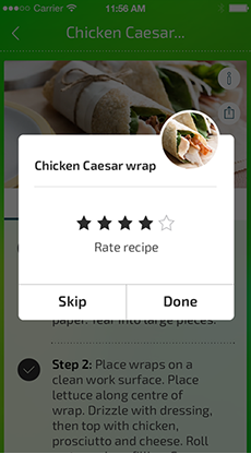
Based on potential partnerships with various enterprise customers – usually the output of a 3 day workshop, these prototypes were used for initial testing with customers.
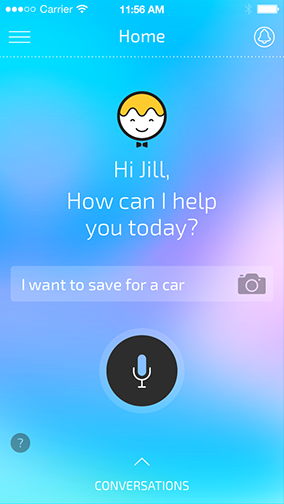
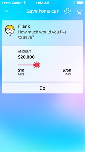






Everyday Bank
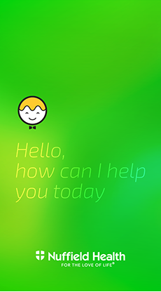
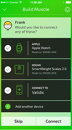
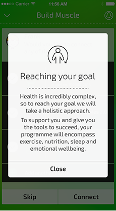
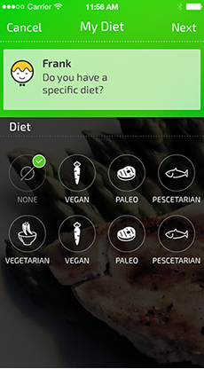
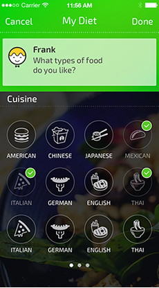
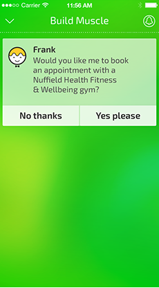
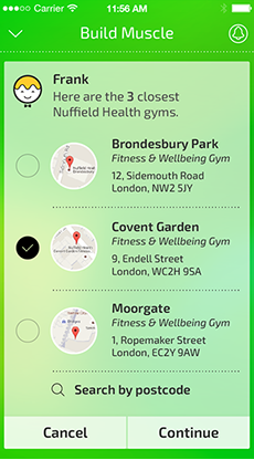
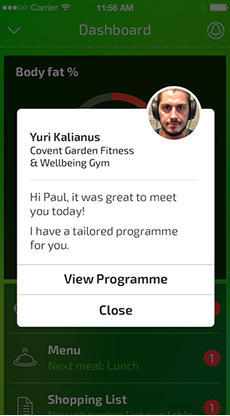
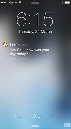
Heath & Well-being
work / case study - mywave + myia
